Ante Up All Styles Battle
This event was originally created in 2015 under the name Battle of the Year. It was a 2v2 dance battle competition open to anyone in the dance community throughout the Seattle area. In 2017, the name was changed to the Ante Up All Styles Battle. This event was fully created and executed by SPU’s Ante Up Student Club.
Role: Event Brand Designer, Motion Graphic Creator (As Ante Up Publicist)
Applications: Photoshop, Illustrator, After Effects
Client: Ante Up Dance Club (SPU)
Project Date: 2017, 2018
2017 Ante Up All Styles Battle FB Event!
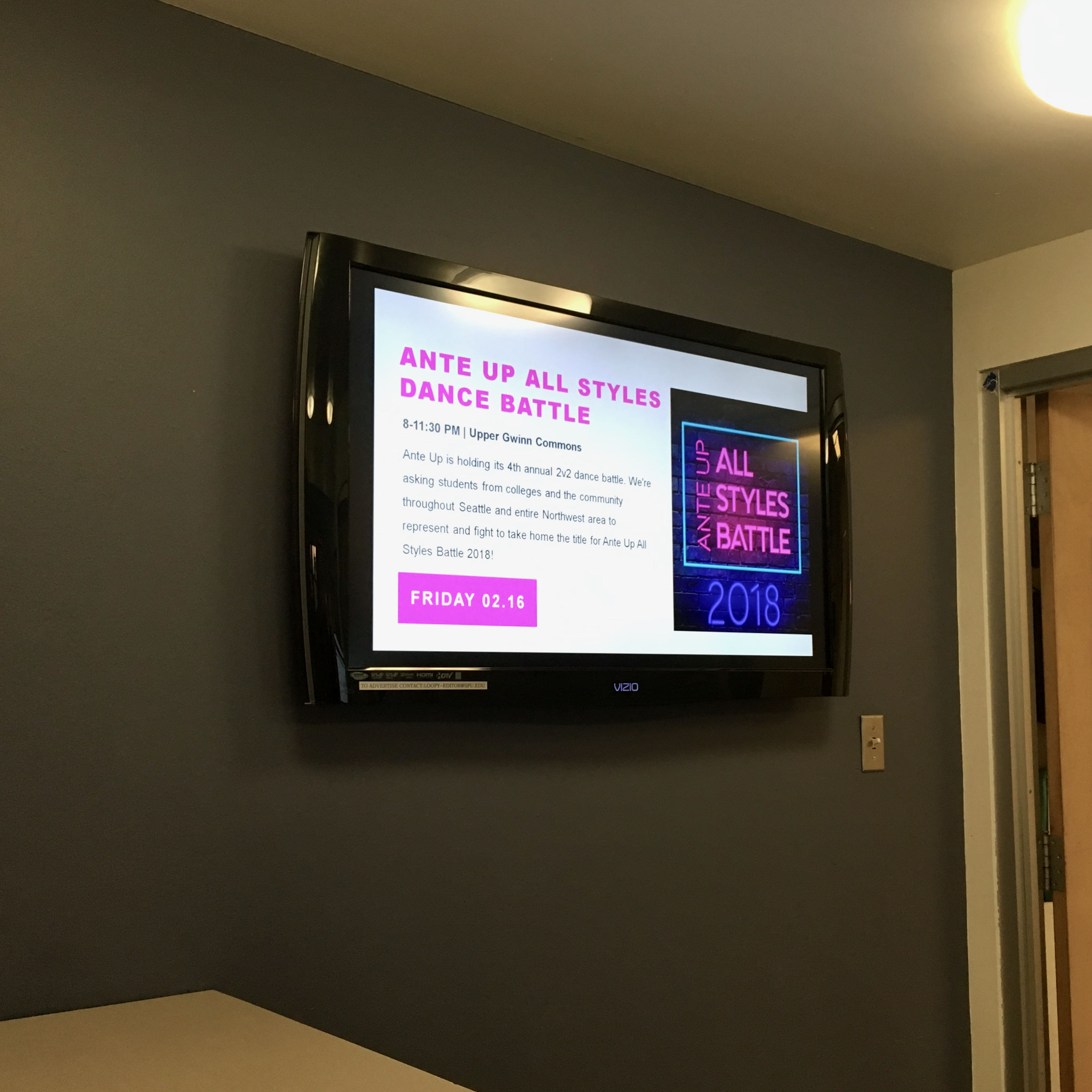
2018 Ante Up All Styles Battle FB Event!
2017 Battle
Inspiration
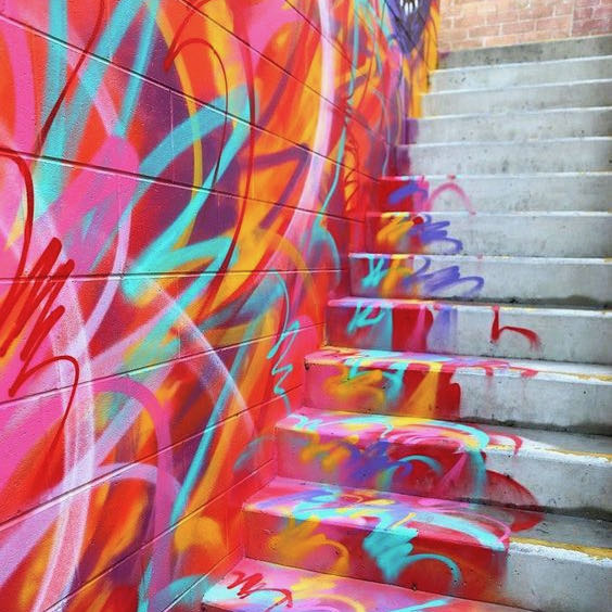
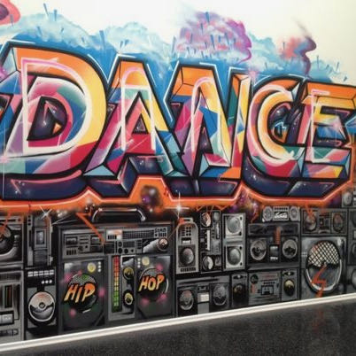
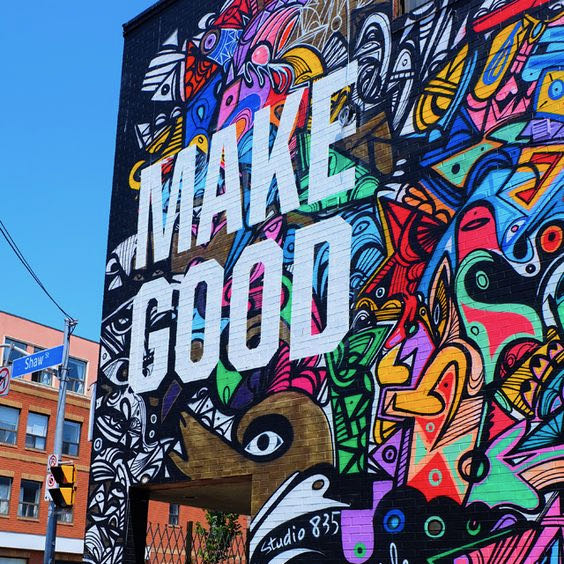
Since the event was a dance battle, I wanted to lean into a “streets” theme using graffiti and spray paint as the inspiration. See More!
Ideation
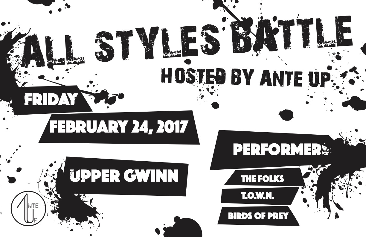
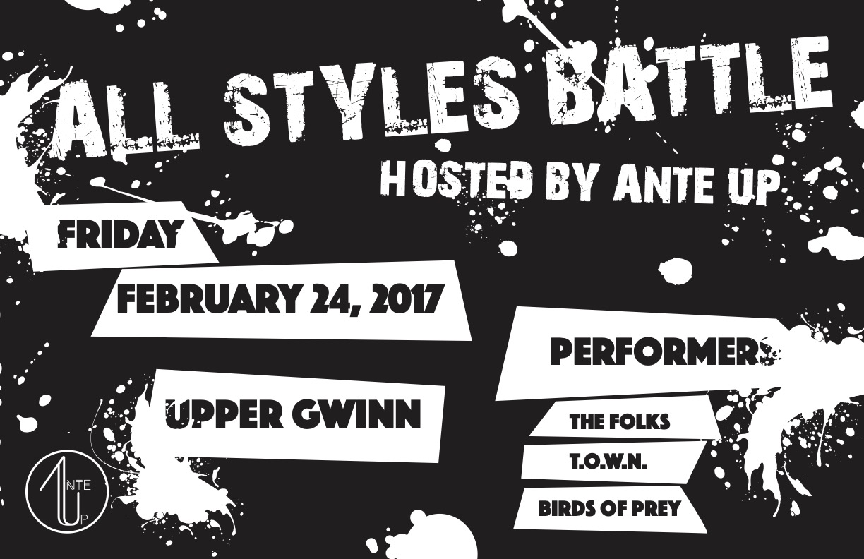
I originally wanted to have the lettering in a graffiti font, however readability was really important and that was difficult with the unique and artistic nature of graffiti. I ended up going with a textured font that more so resembled stenciled, painted letters. This option was readable and still gave off the the idea of imperfect creativity that I was going for.
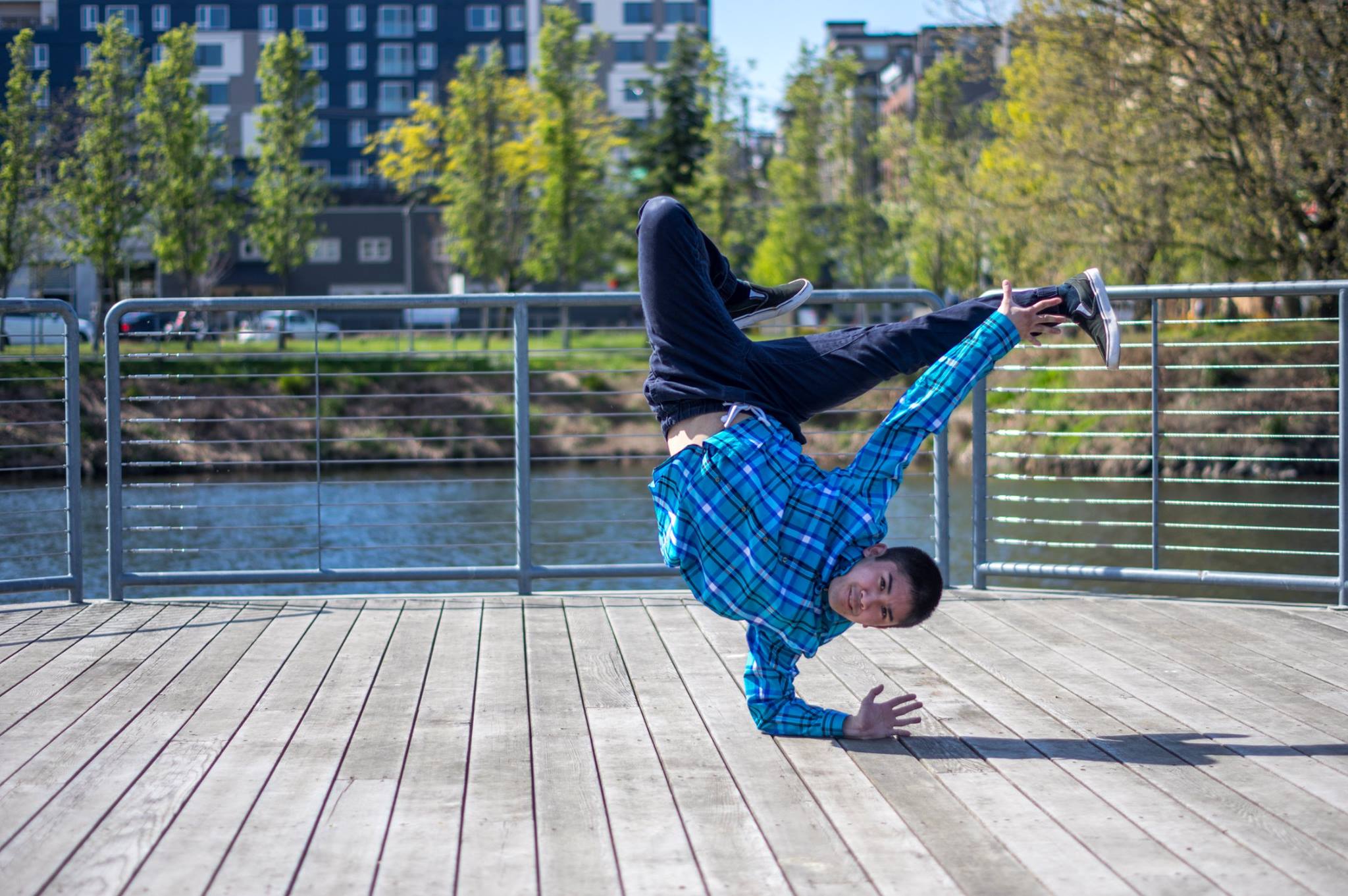
The first design had a graffitied brick wall as the background with added splatter paint elements. I included a b-boy dance silhouette that I made in Photoshop from an image of one of our dance members. I thought this would better help the reader understand what the event was since it wasn’t explicitly explained in the title.
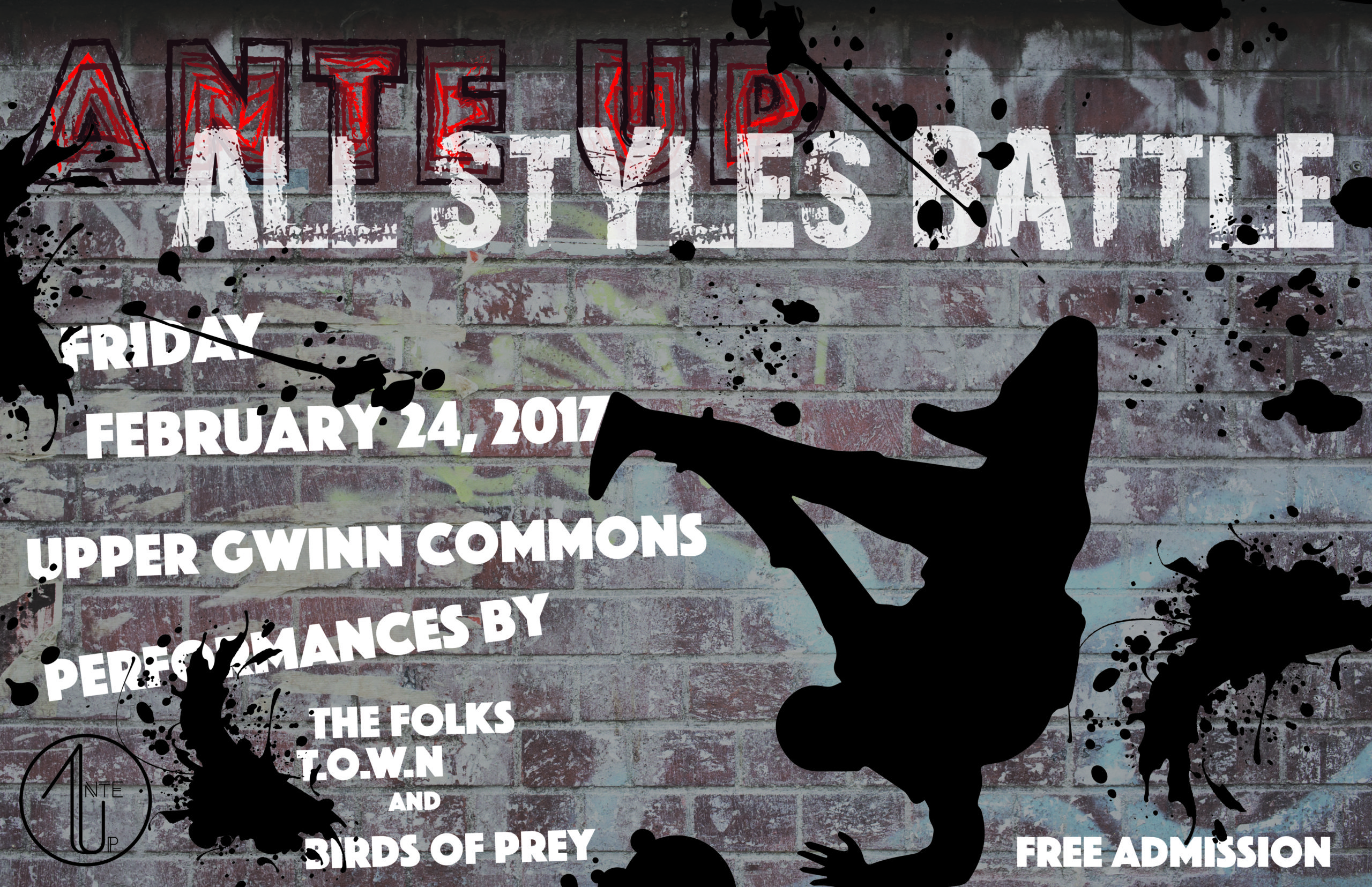
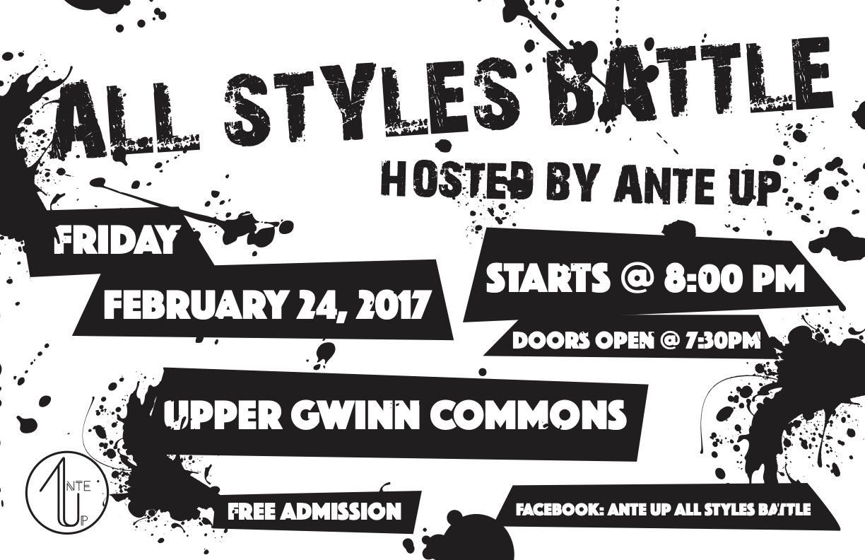
We had featured performance groups at the event and we wanted to highlight them on the poster. However, we ended up switching that content out to be able to include more event details. Since this event was open to the community, not everyone would be familiar with the location. I also chose to highlight the fact that the event was free since that could be a deciding factor as to whether someone would attend or not.
Final Result
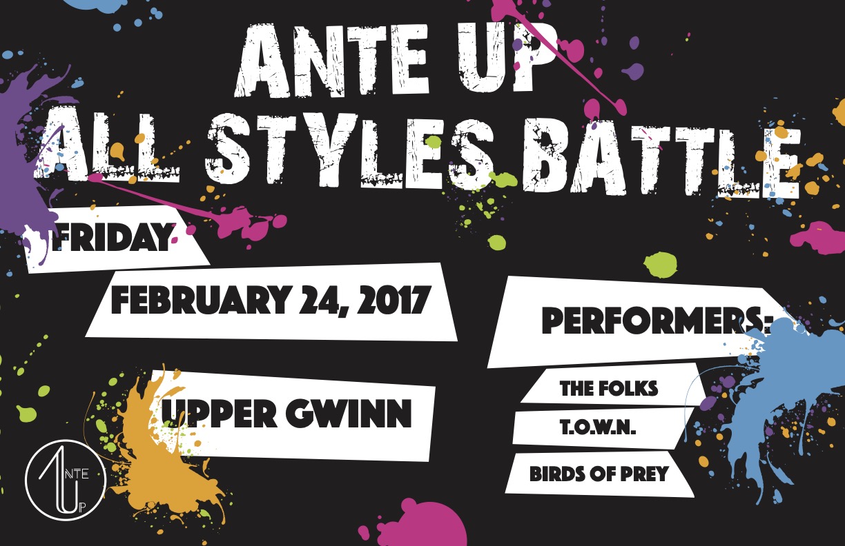
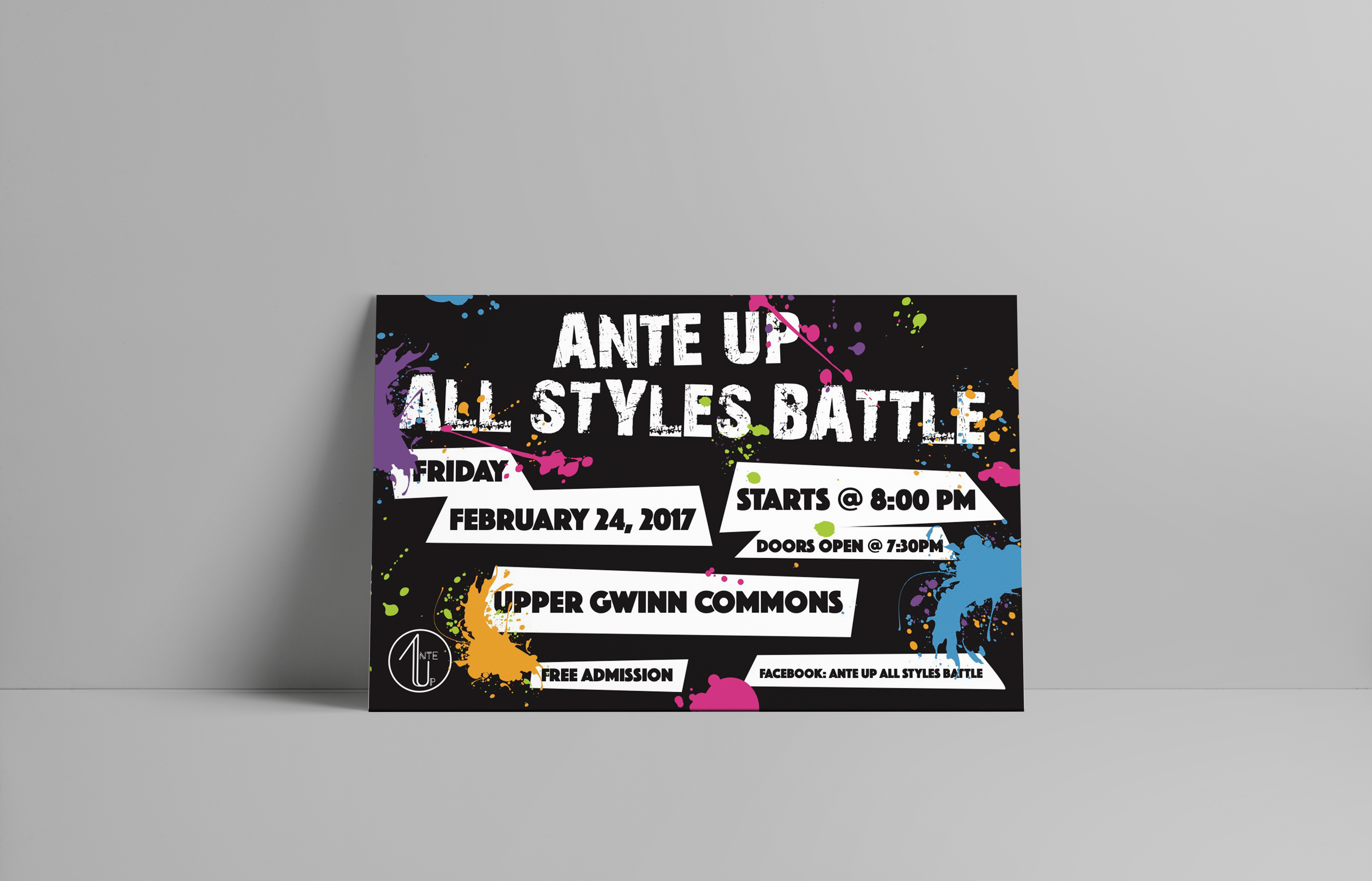
This was the final poster design we ended up putting up around on and off campus. I liked the boldness of the Black and White options, but the color added more personality and evoked a sense of fun and creativity that the event was supposed to represent.
2018 Battle
Inspiration
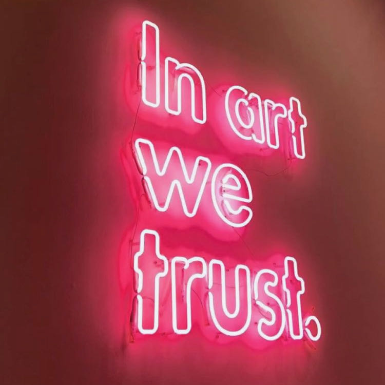
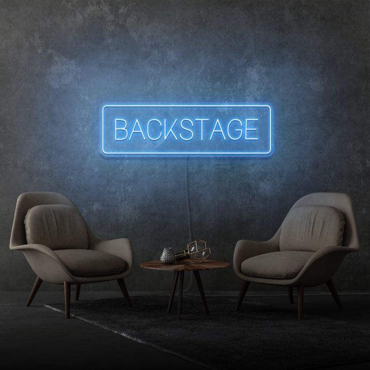
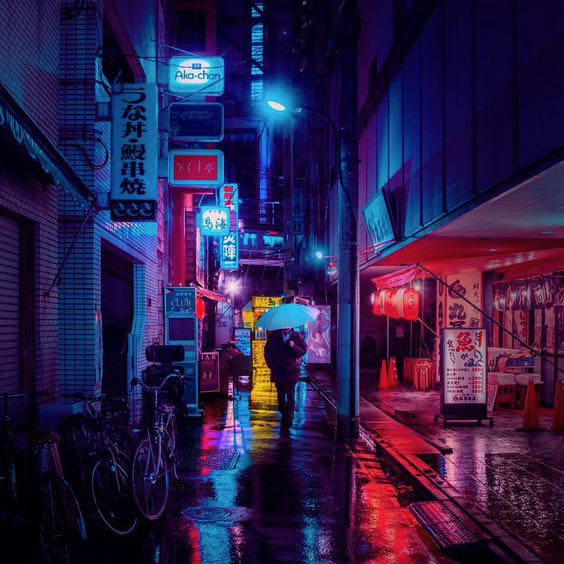
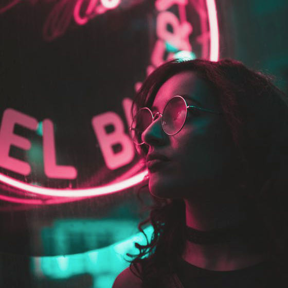
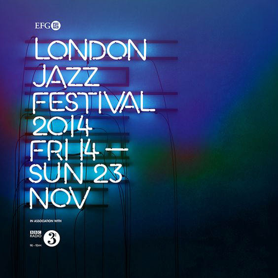
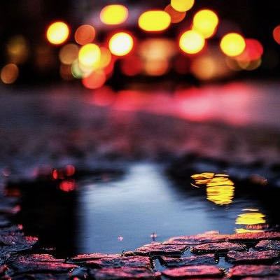
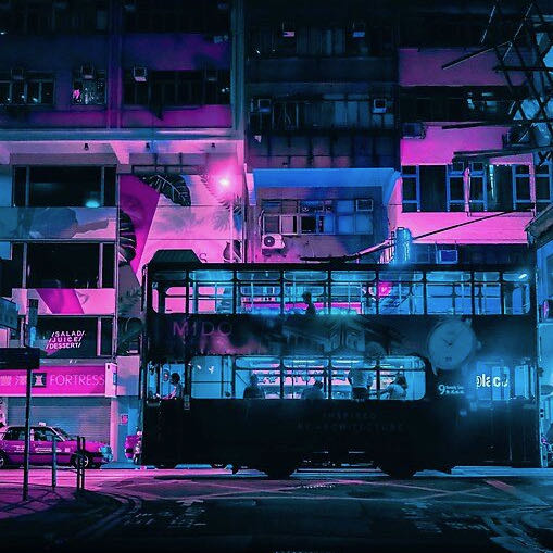
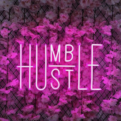
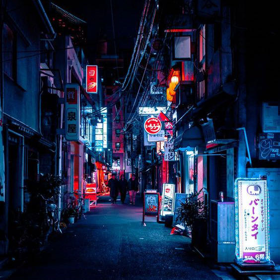
Looking back, I realized that there was a lot happening with the multitude of textures that were included in the design. Learning from what I did previously, I scaled the design way back. In still keeping with the “streets” theme, I kept the brick wall, but this time – no graffiti. Inspired by night street photography, I noticed that there is always unique light sources in the images. Most of the time the light comes from neon signs or light messaging boards in different colors. I thought it would be cool if the design went in that direction and the poster looked like a neon sign. See More!
Logo/Type
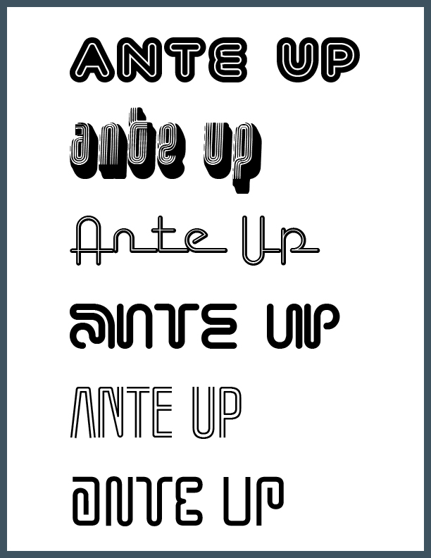
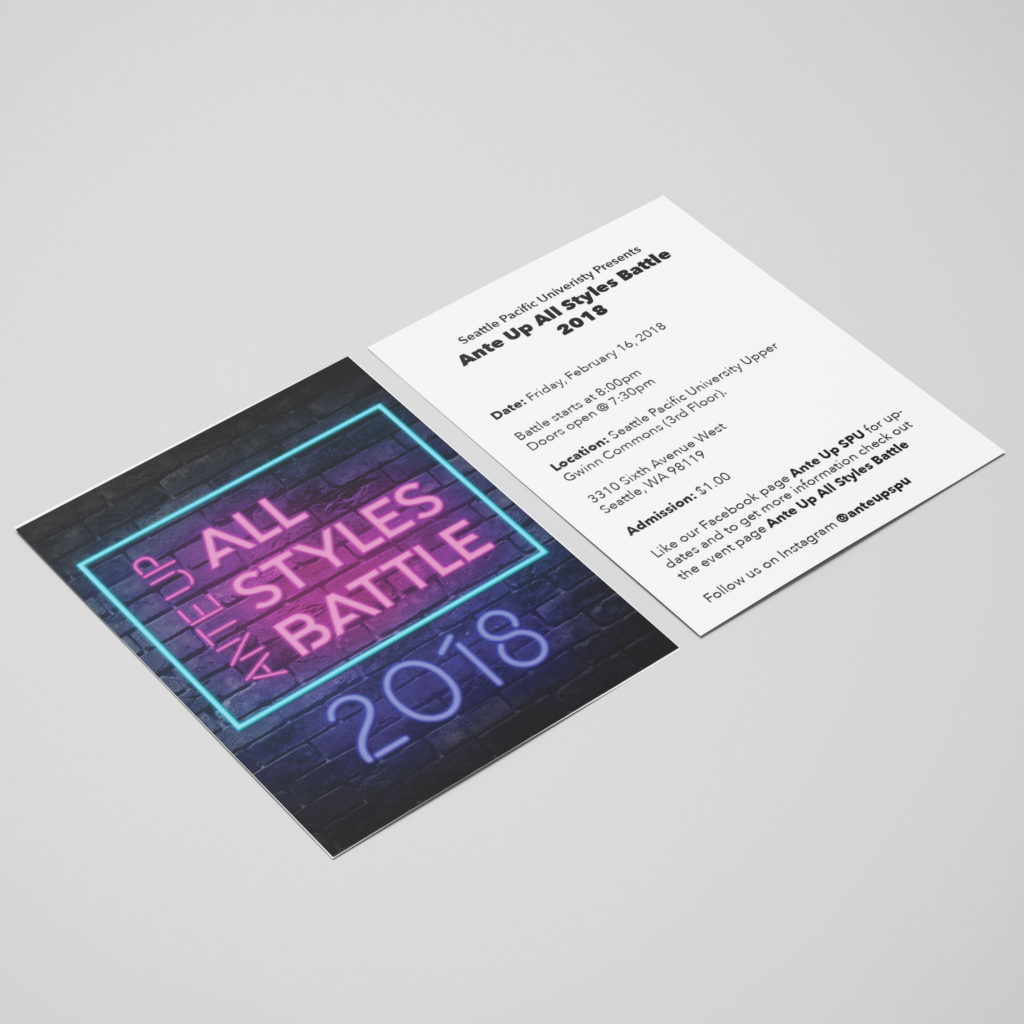
With the information that needed to be included in the poster, it would have been too much to have everything be presented as a neon sign. This lead to the creation of a separate logo using the title of the event.
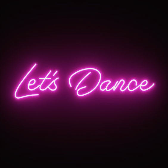
Since the the text was supposed to emulate a neon sign, I looked for font options that would look realistic as if it were an actual neon sign. Neon signs are made from glass tubing that is bent into the desired letters or shapes. This glass tubing houses inert gas that creates the different colors when electricity passes through. Because of how neon signs are made, I looked at fonts utilizing structured lines that connect with one another.
Color
Since pink is considered a tint of red, neon pink and neon blue work together how primary colors work together. The pink evokes a vivacious and joyous energy where as the blue brings a calm to balance it out, yet still brings the energy due to its neon nature. This color scheme worked together to set the mood for the event.
Nightlife and clubbing are strongly associated with fluorescent signs in cities after dark. When overlaid against dark backgrounds, the colors really pop and catch your attention. Even though the poster itself was not a neon sign, I still wanted the same effect so it would catch your eye the same way.
Final Result
The first design had everything encapsulate in a circle. I wanted to add in the year to help date when this battle took place. Adding the year took away form the balance already held inside the circle so a rectangle replaced the circle and the date got pushed to the below the title.
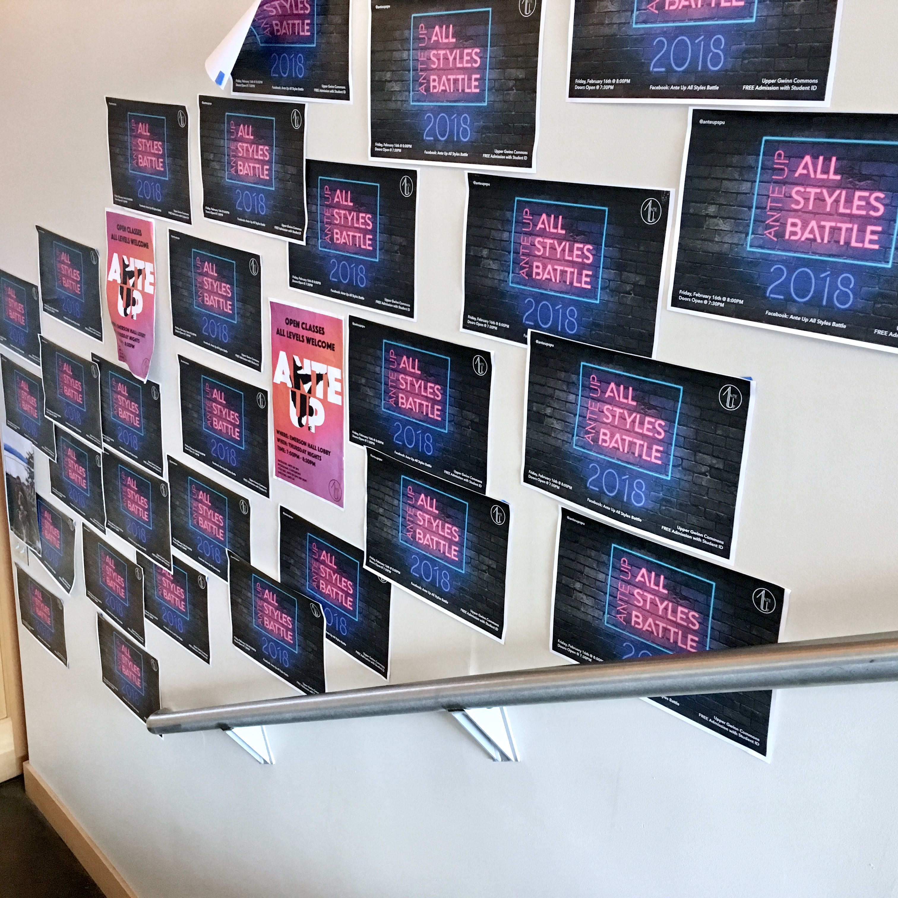
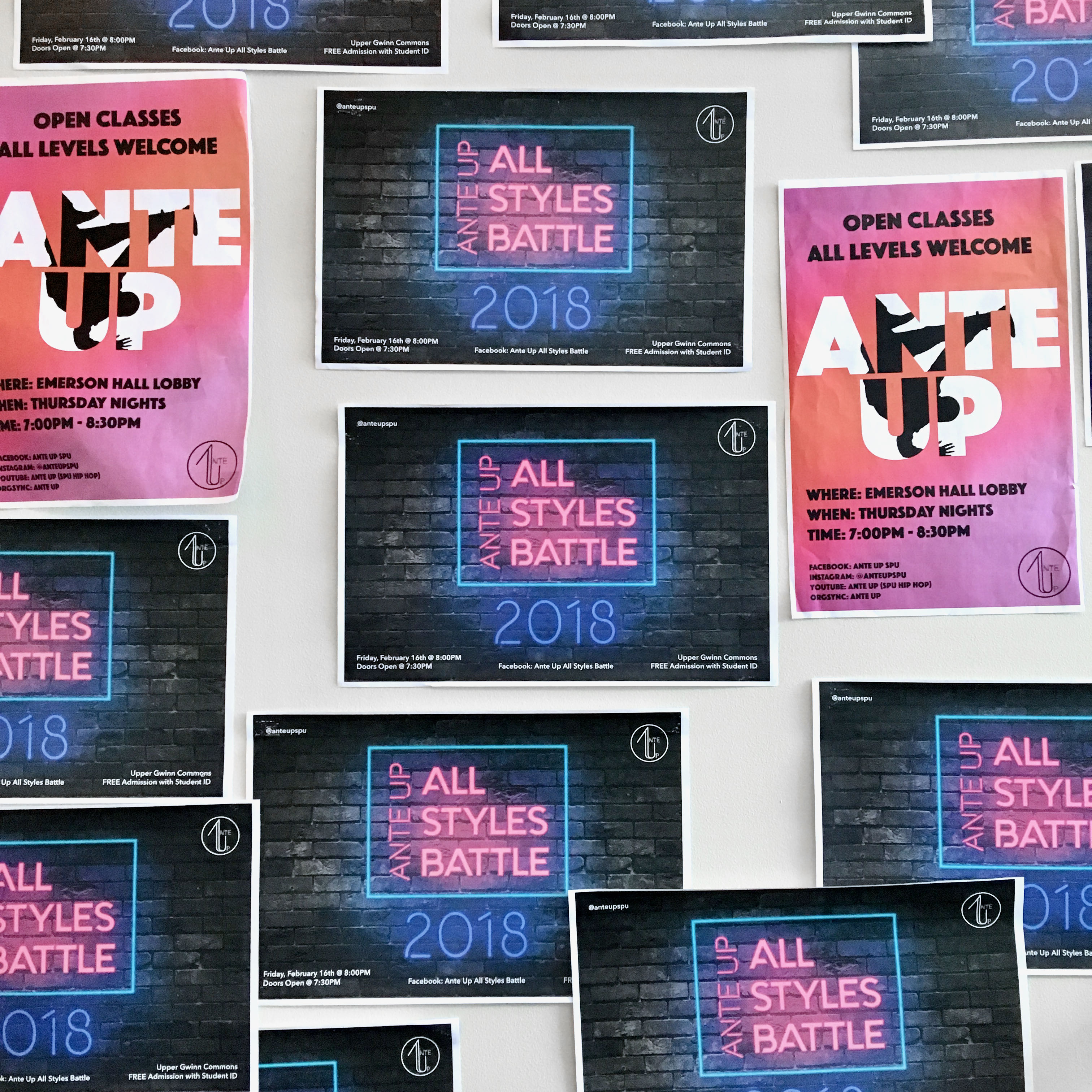
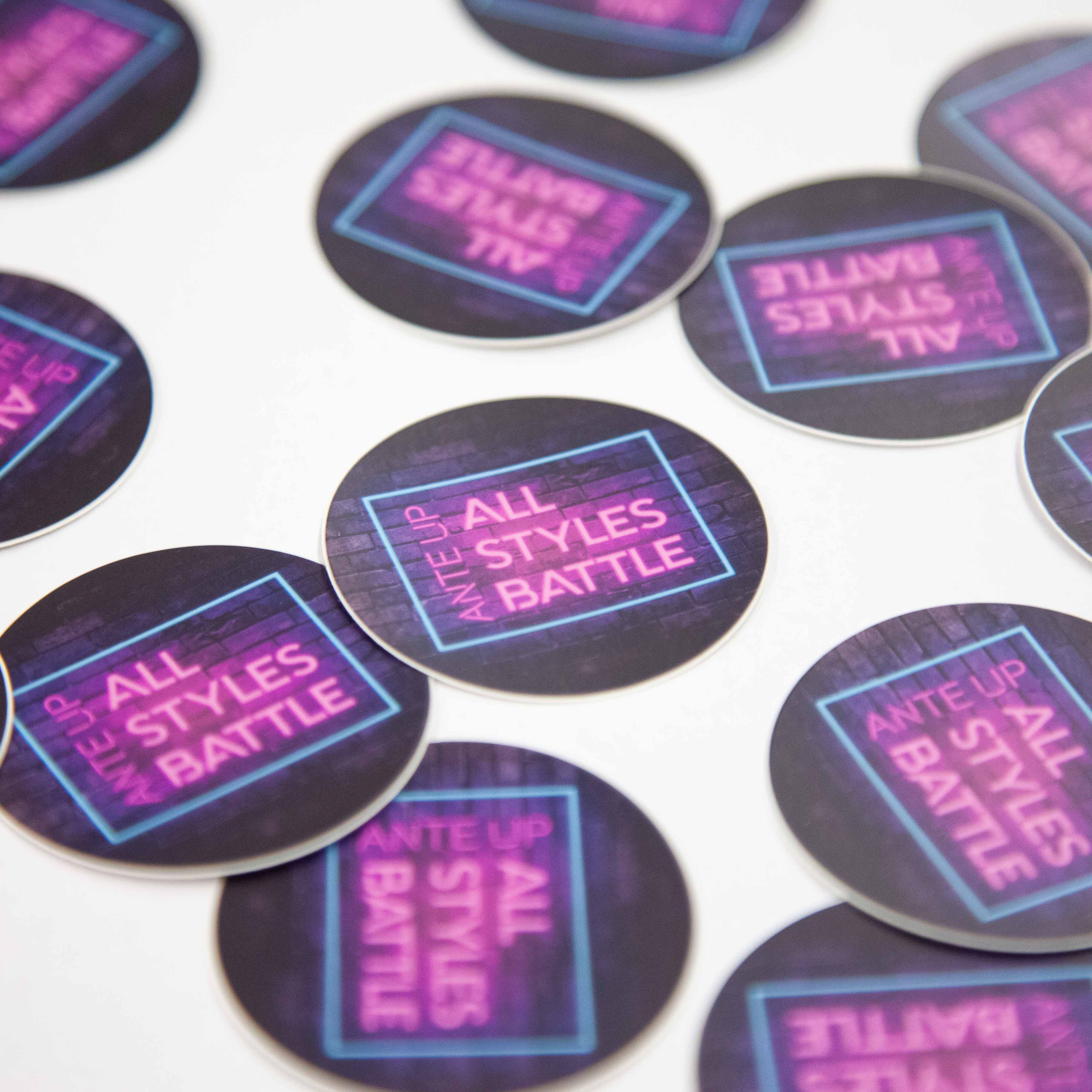
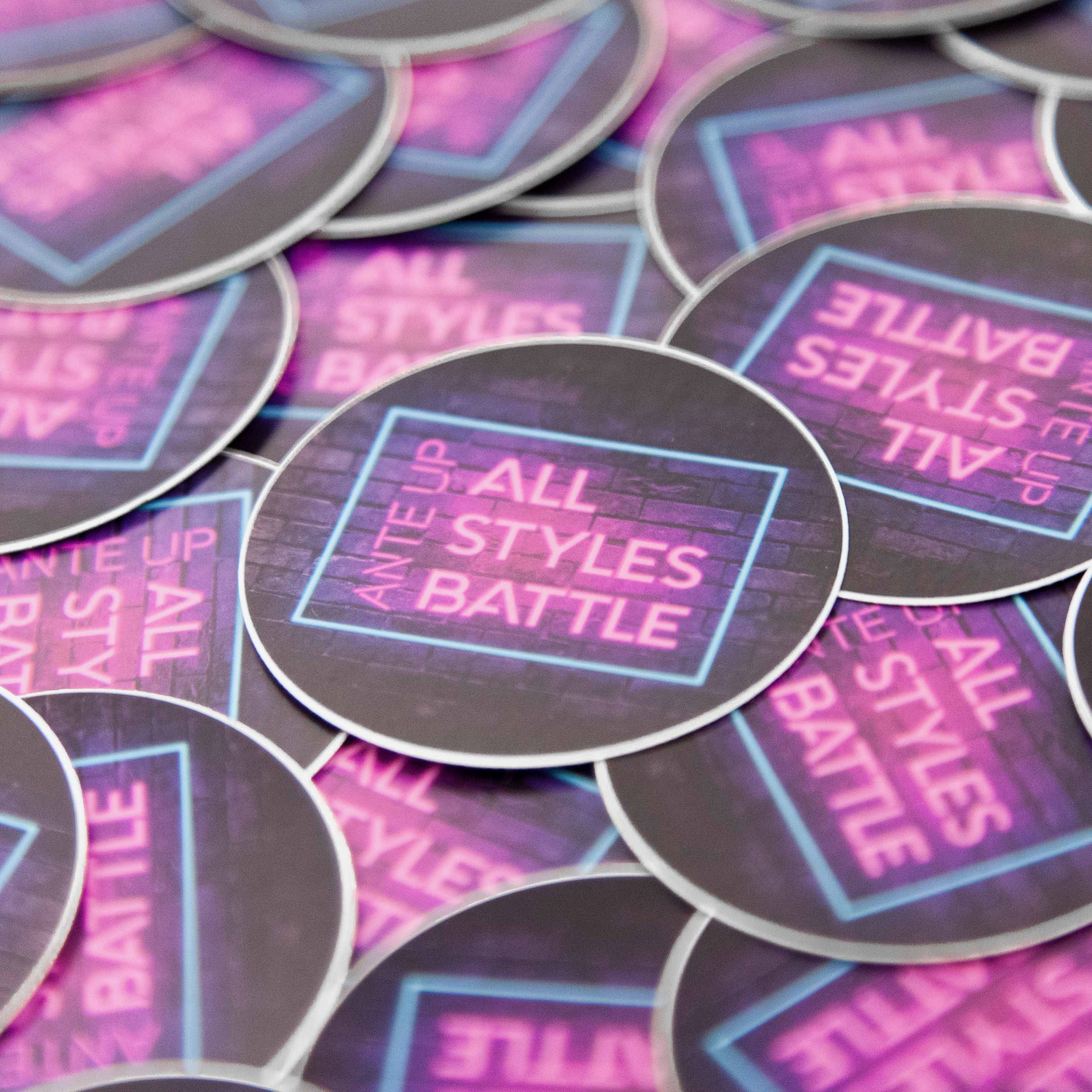
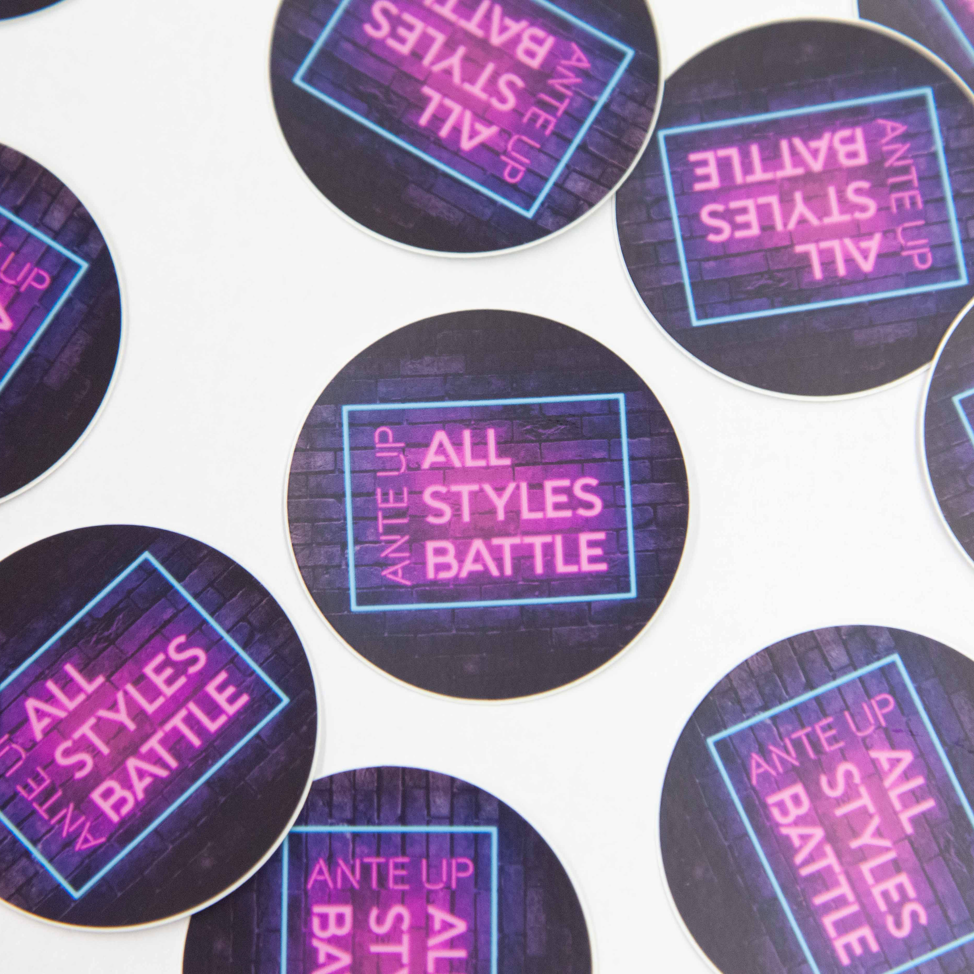
The final design was modified to fit an array of pieces to help promote the event. These items included posters for the event for both on and off campus, fliers to pass out, banner images for publicity on campus, social media assets, as well as a sticker design.
Since the final design was a neon sign, I thought it would be cool if it could embody a lifelike flicker that a real neon sign would have. For digital spaces we were able to utilize motion. We had it playing in the background throughout the night of the event, and on Instagram we posted the motion graphic instead of just having a static image. See this Design on IG!