Imitate Conference
Imitate is a hypothetical Print Design Conference intended to spark the interest of print design in young design professionals and students who are thinking of further pursuing a career in print.
The mission is to provide resources and guidance to young professionals in their 20’s and early 30’s who are interested in pursuing a career in print design.
Role: Conference Designer
Applications: Illustrator, Photoshop
Project Date: 2018
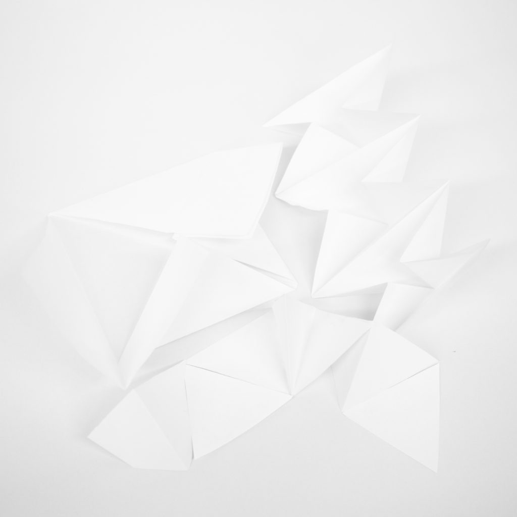
Inspiration
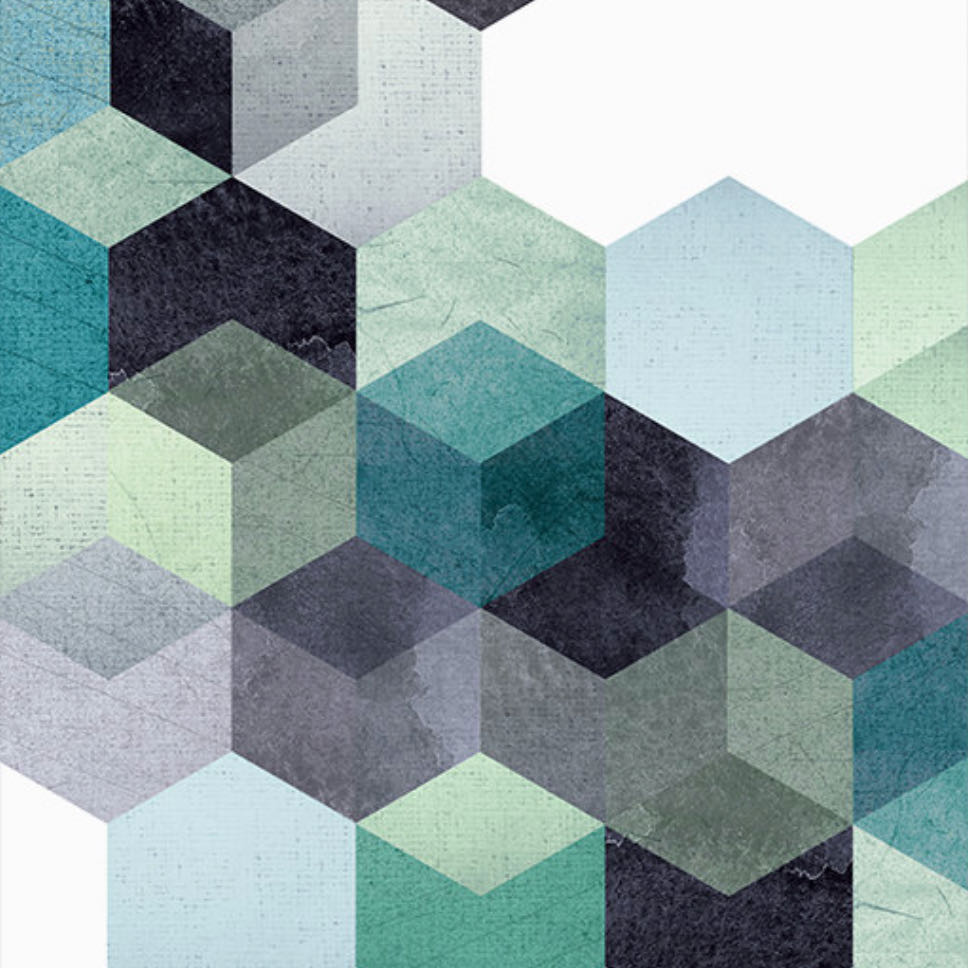
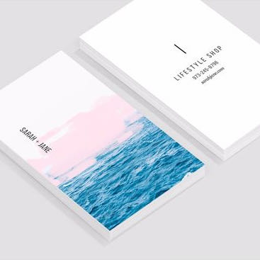
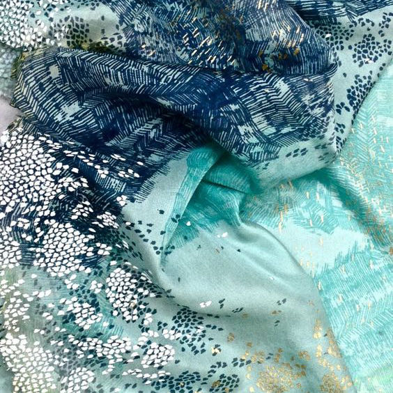
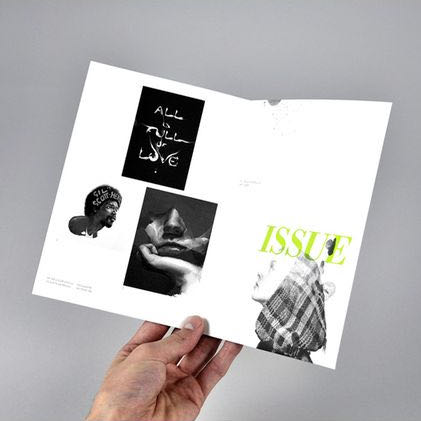
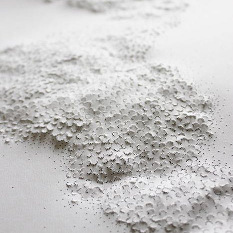
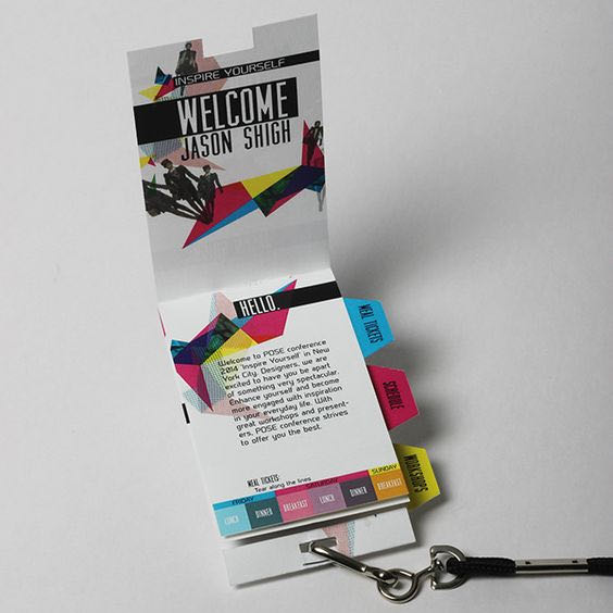
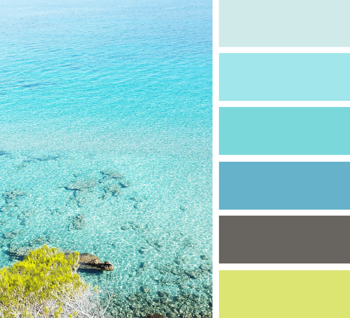
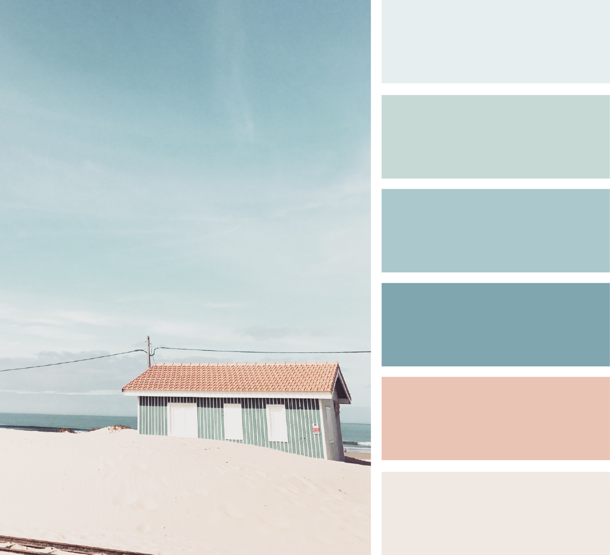
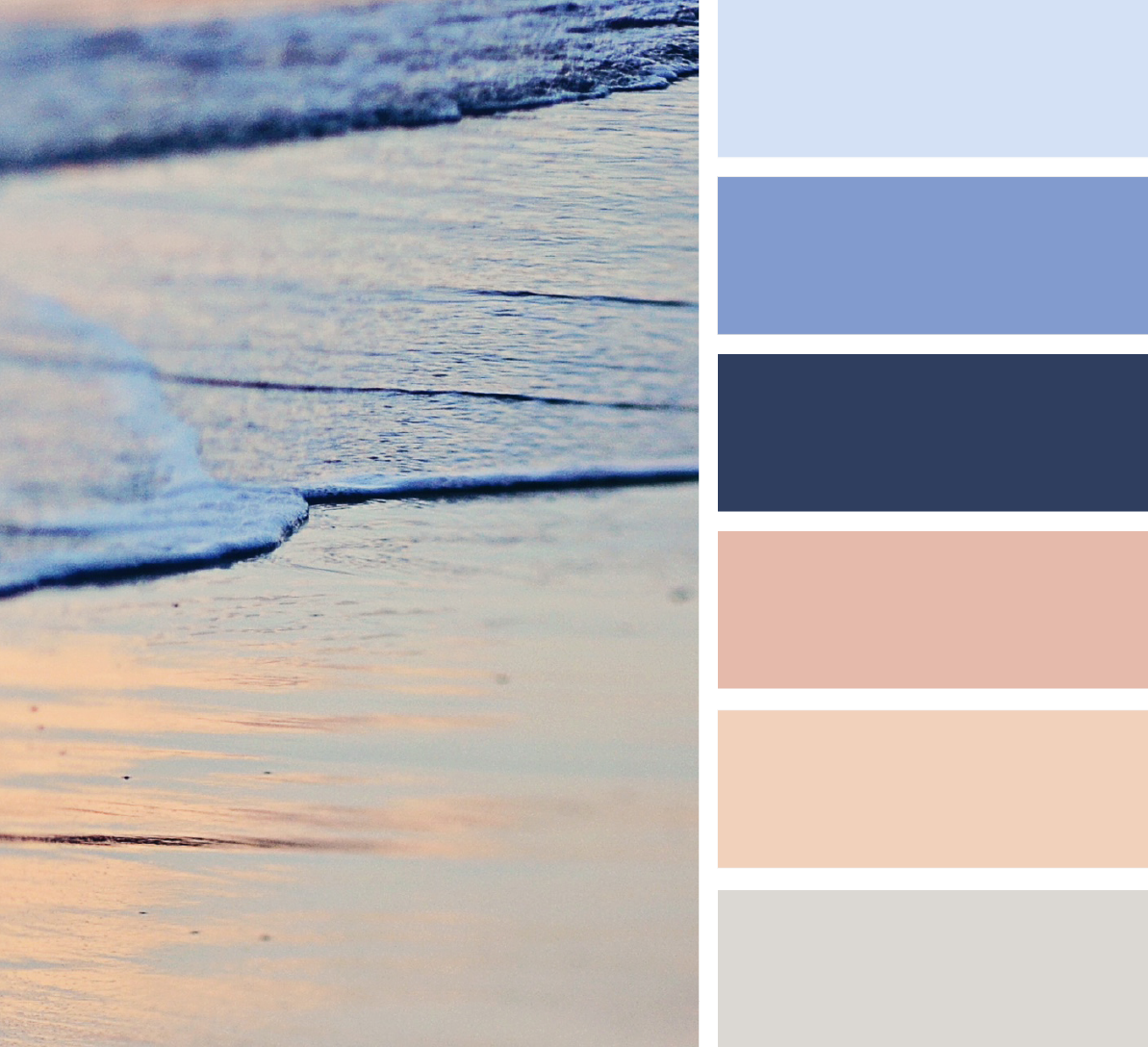
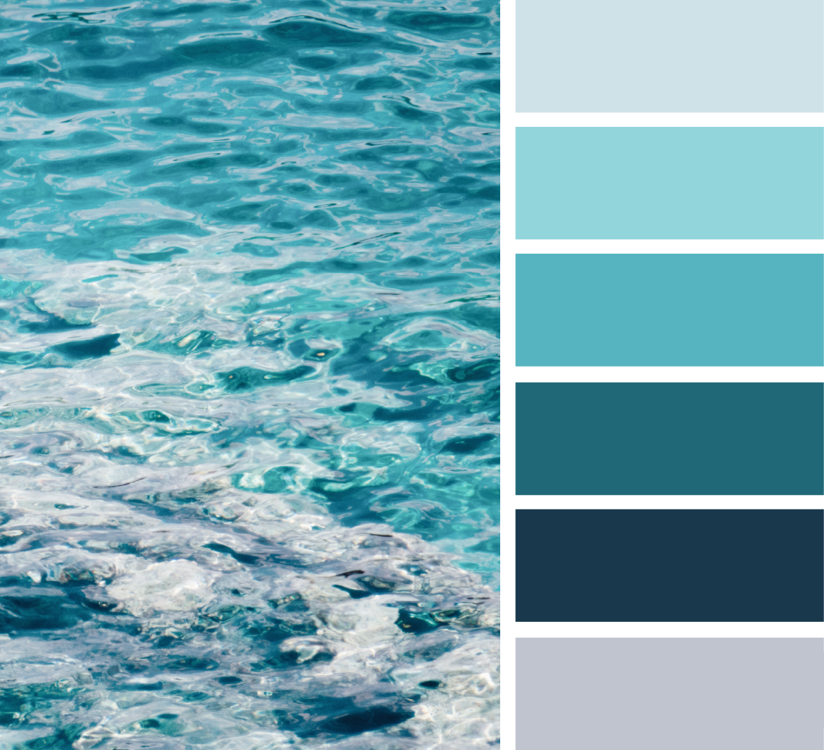
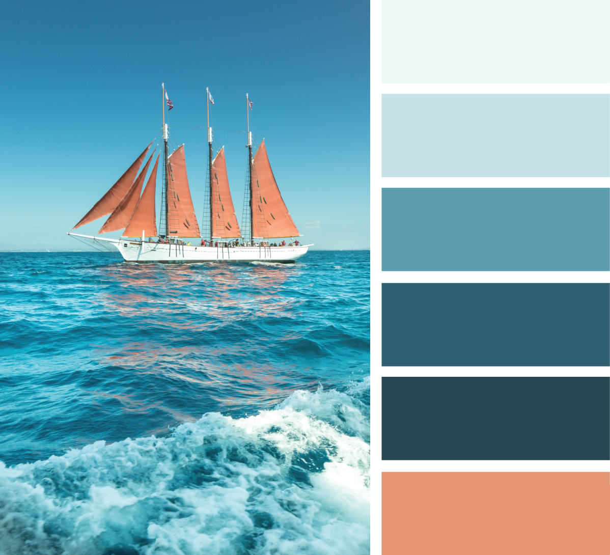
I looked at physical paper textures, potential color palettes, and conference materials – including booklets, pamphlets, and name tags. See More!
Naming
Imitate alludes to the idea of repeated production. Though it’s not an exact replica, when printing, each copy is an imitation of the one before it. In the word itself, there is repetition with 2 Is and 2 Ts repeated.
Imitate also refers to the action of imitating others. Through imitation of those who have come before us, we become better designers by learning from their successes and failures. As they say “Imitation is the sincerest form of flattery.”
Logo
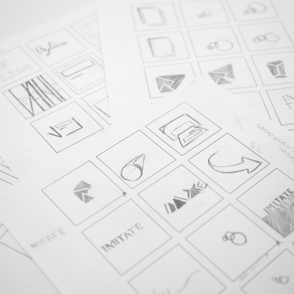
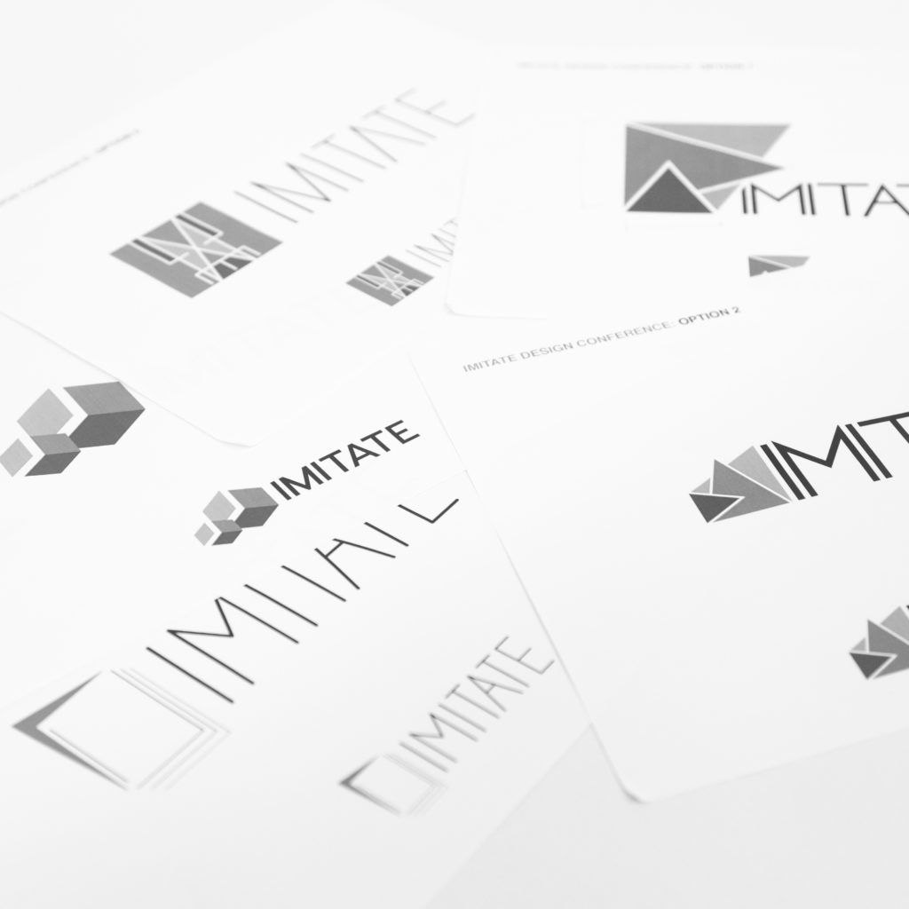
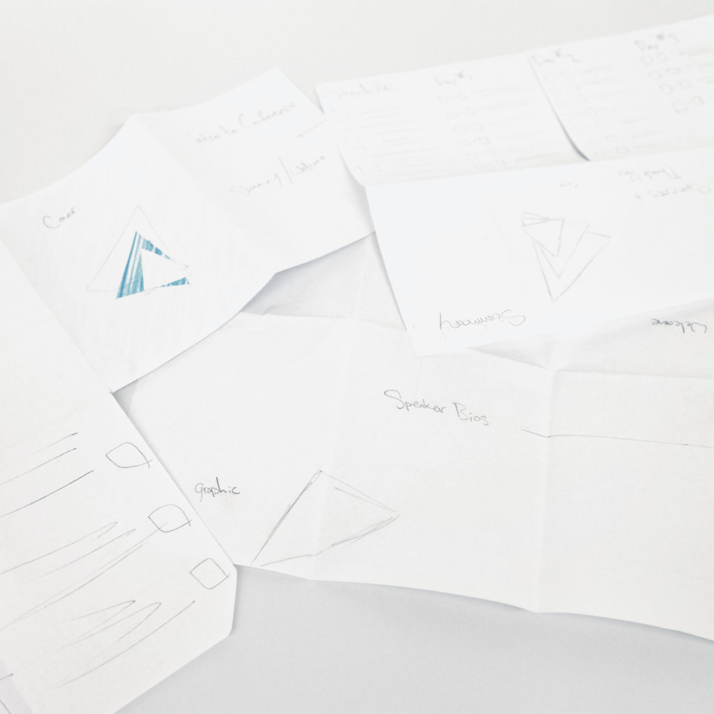
For the logo I was looking at this idea of shapes repeating or “imitating” each other. Because print design is so physical, every time something is printed it will be a copy of the previous print. It may look similar, but no two prints will ever be exactly the same. We started with pen and paper to be able to explore different possibilities of where we could take the logo. Once we had different potential ideas, we moved them into a digital format to refine them and easily see multiple scales.
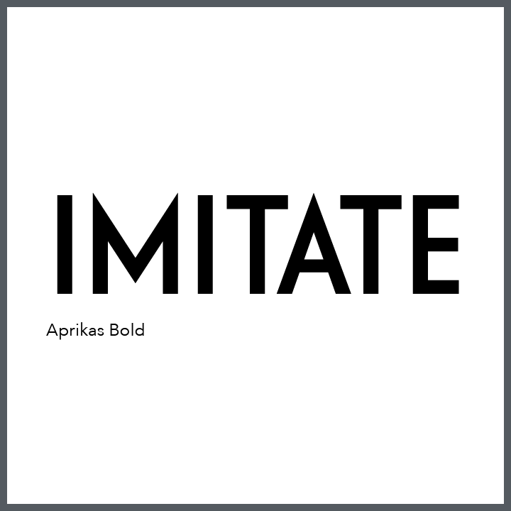
Type
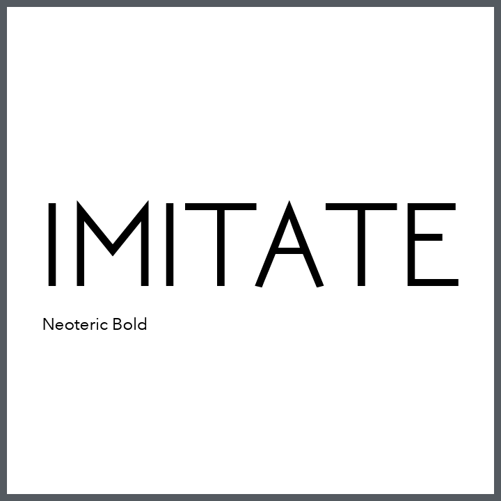
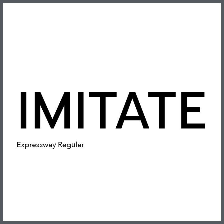
I knew I wanted something more modern to represent that print design is still relevant in this continuously evolving digital world. I originally started with Neoteric Bold. I liked how sharp the letters came across and how modern the overall look was. However, I decided that the font was too thin and I wanted something that would stand out more prominently. Expressway Regular still kept the modern look, but was bolder in its overall presence. Because of the flatten apexes in the M, the overall look wasn’t as sharp, so I kept looking for something that embodied both pieces. I finally came across Aprikas Bold that also had a tighter kerning which I felt helped emphasize the repetition of the Is and Ts.
The final logo is a modification of the Aprikas Bold Font. Since the vertex of the M moved from the X Height in the Neoteric Bold font to touching the Base Line in the Aprikas Bold font, I took out the Crossbar in the A. I wanted it to mimic the open space that was now created by the mid strokes of the M and imitate the triangles that ended up being part of the final logo.
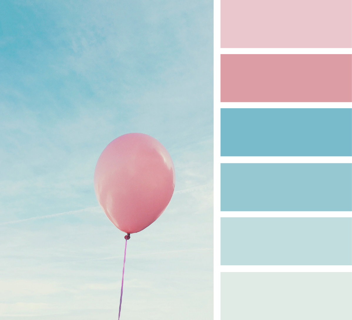
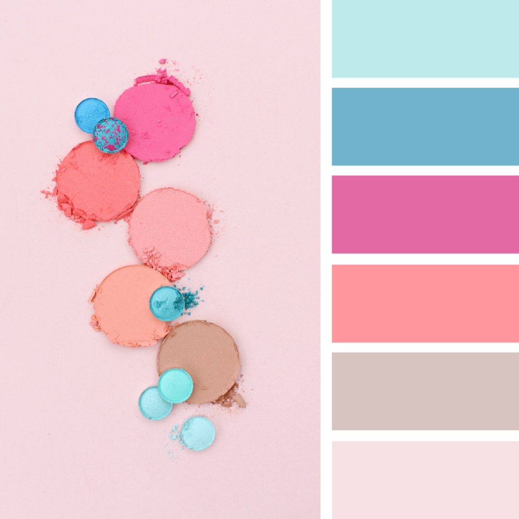
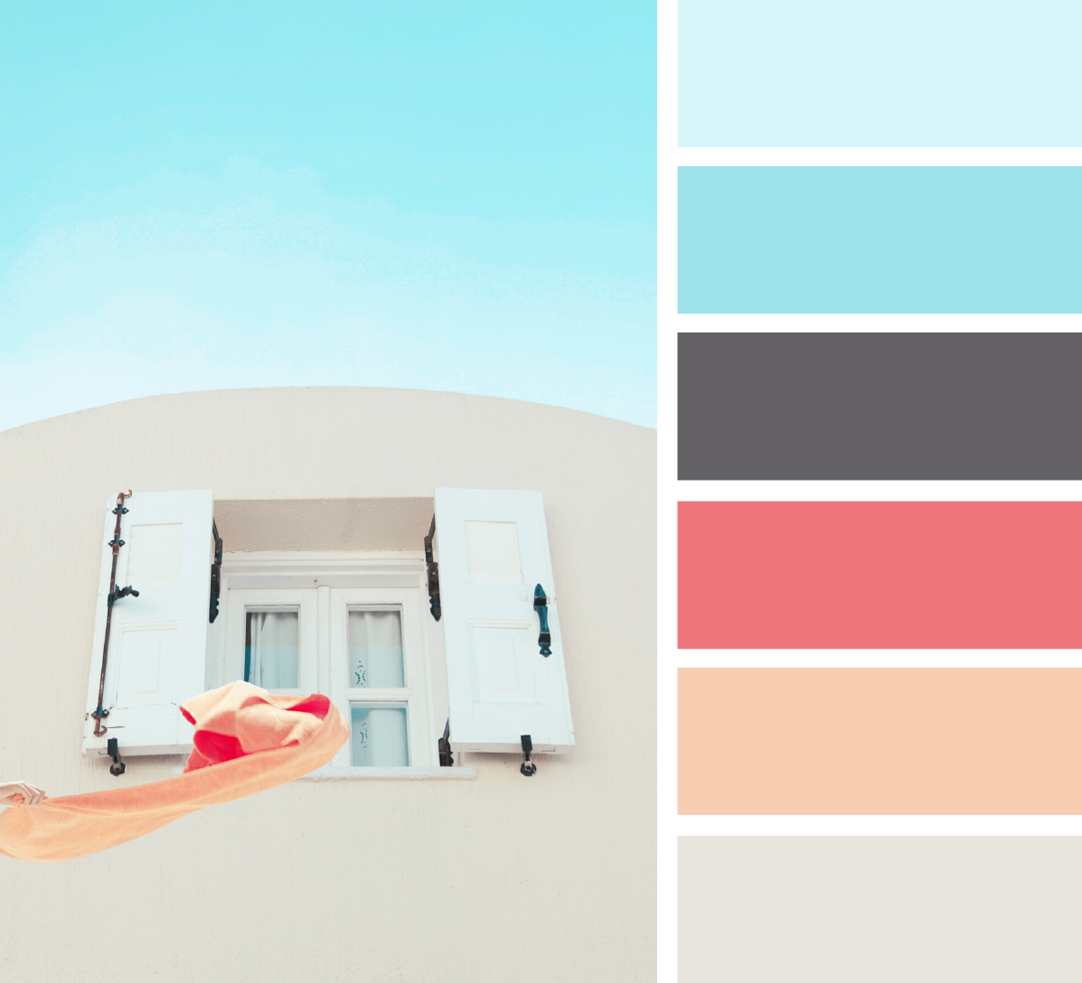
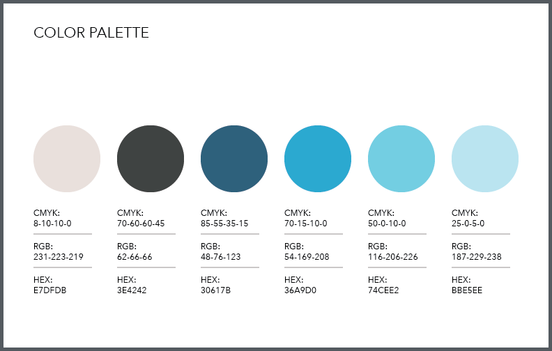
Color
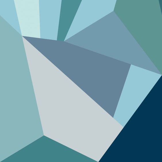
With this conference I wanted to evoke a sense of calm. It wasn’t supposed to be loud or ground breaking, the goal was to be approachable and accessible for everyone, including those who may be getting into print design for the first time. The final color decision was a blue monochromatic palette to help evoke a sense of openness to all the learning possibilities.
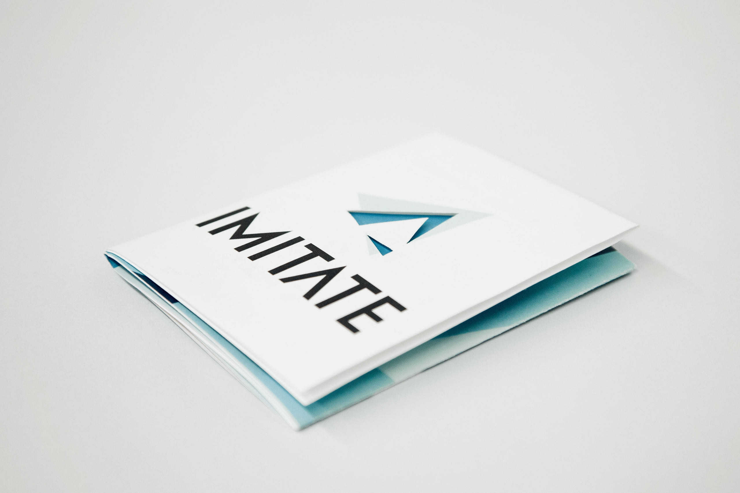
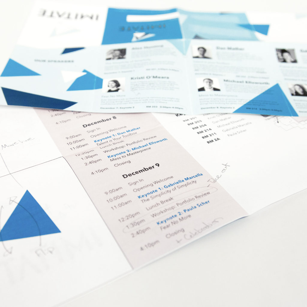
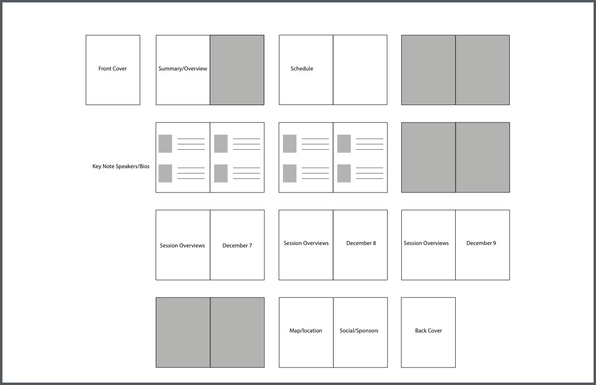
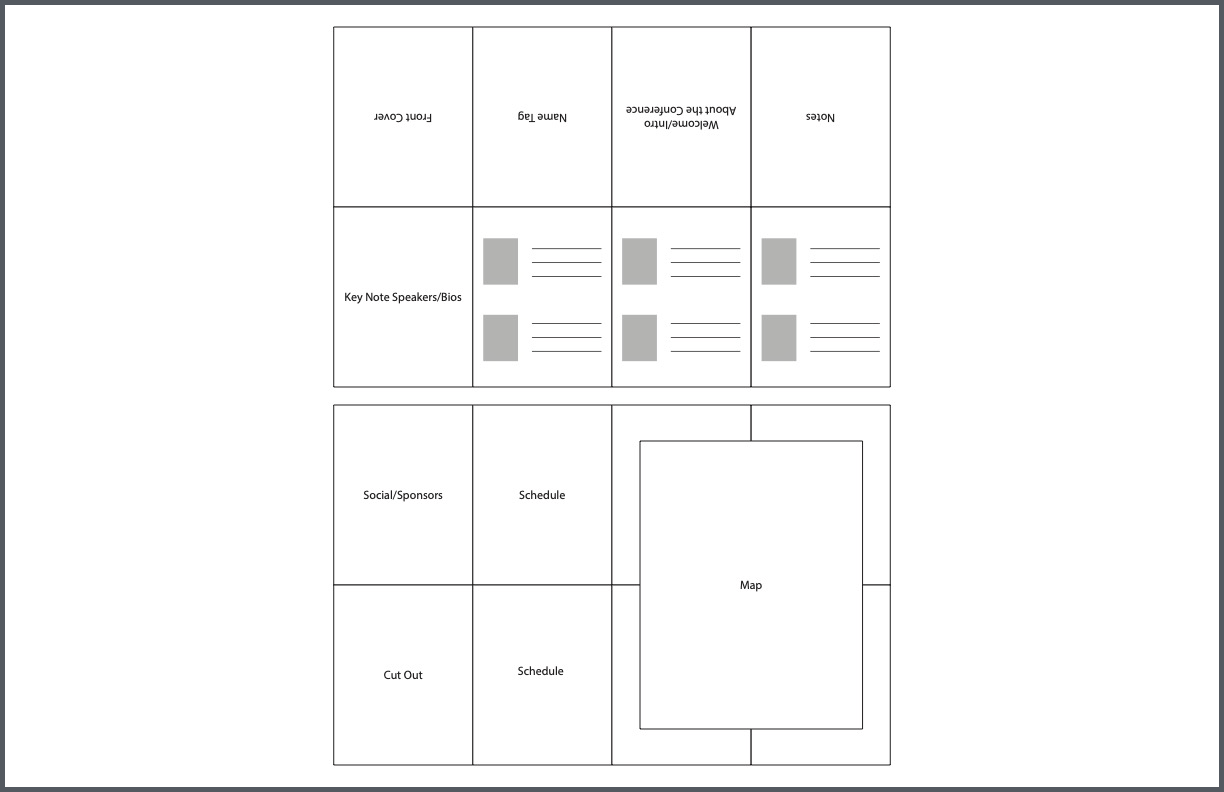
Conference Program
What started out as a boring booklet, got condensed into a double sided fold-out that would be more convenient to the user as they walked through the conference. Originally, full bleed images were placed to designate the different sections, but by condensing to only the important information, unnecessary page flips were eliminated which lead to a more efficient design.
Final Results
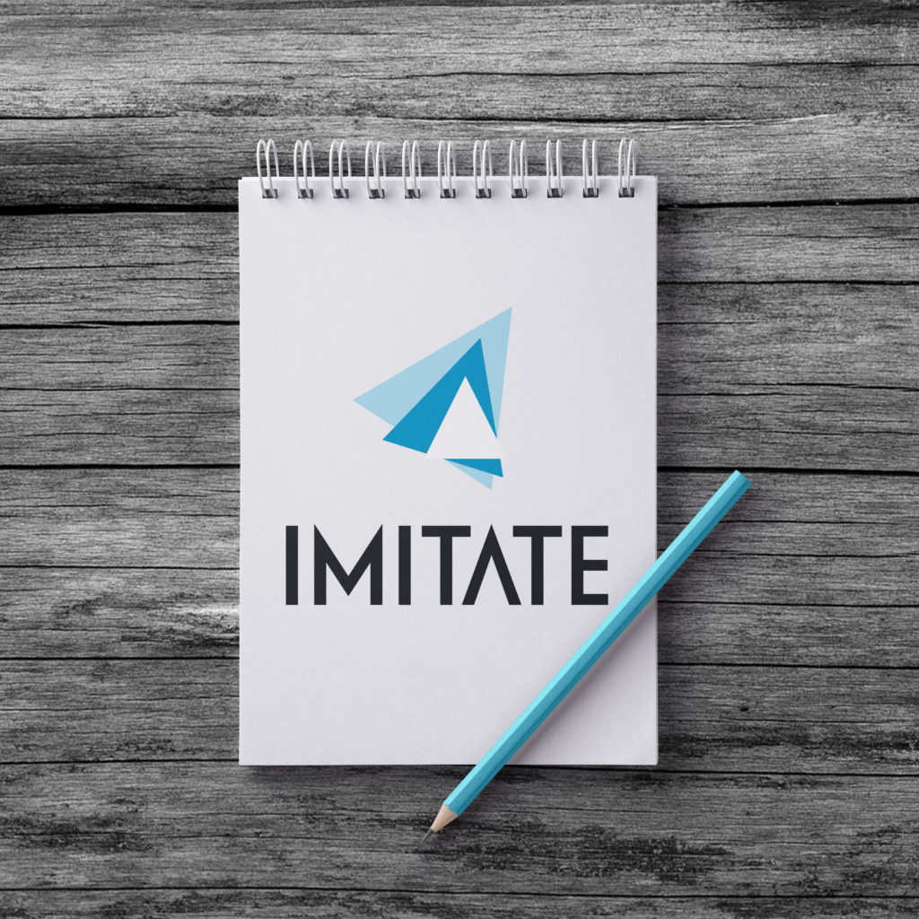
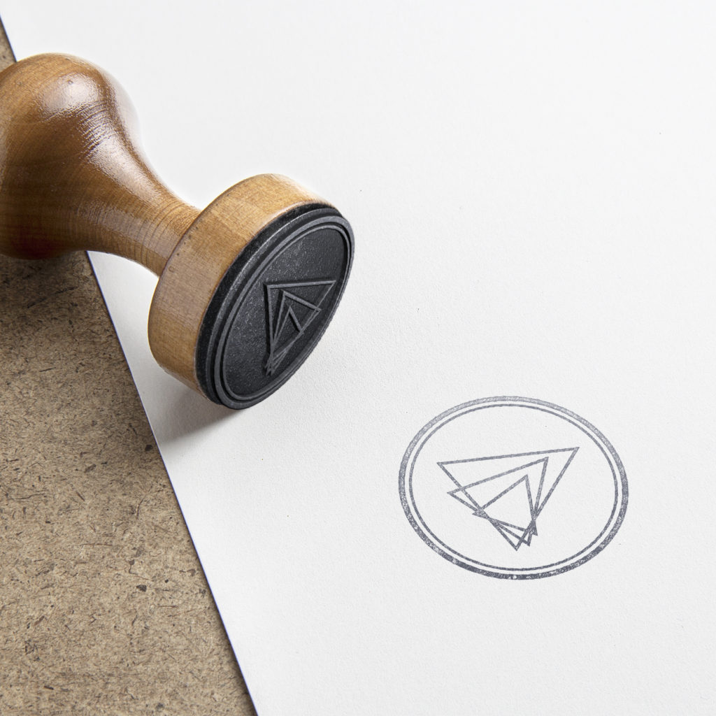
Below is the final conference program design, the lockup presented on a notebook that could be given to conference attendees to be able to take notes in, and a stamp of the logo to be used in marketing materials and mailed communications.